Maison Martin Margiela is a huge inspiration in all my work.
I have rented several books from the library and constantly have them on return
and literally lug them round with me just for the sake of having that
inspiration with me. I love how the house addresses the ideas of ‘the body’
(whatever shape it may be) and somewhat protects it with distressed tailoring.
The House’s philosophy is precisely informed by a procedure that refuses to be
governed by the compulsive view that fashion should reinvent itself entirely
every single season. Two aspects really interest me about the house’s work:
- 1. The concept of time and its view on the human
body. The concept of time is interpreted in various ways: as the duration that
is expressed through the use of certain fabrics and the objects relating to the
passage of time and the process of ageing; time in the view of the history of
fashion and finally time as referring to the history of the garment itself
which is made visible through the externalization
of the production process = the sewing of darts on outside of garments/
revealing seams etc. How does this
relate to my collection? I want to use Hemp fabrics,100% Linens and organic
cotton etc that literally break down over time hence have a history – life. I
want my collection to be able to be worn in multiple ways by both men and women
therefore the clothes make their own history through how the wearer chooses to
wear them and how they fit the individual body shape. Lastly, the process of
zero waste pattern making could be effectively externalized in the garments with folds on the outside of
seams etc – this works (to me) as by wearing zero waste you are literally
presenting a change in attitude in our consumer driven society hence this
should be exclaimed and presented to outsiders. I also like the idea that the
garments – through the fabrics/production literally show the idea of ageing and
decay which draws from my inspiration from the Margareta collection of the Grey
Gardens documentary.
-
2. Maison Martin Margiela changes, significantly,
the standardized body as prescribed by fashion. (By this I do not mean going
against stick thin models etc – rather diving into the idea of male and female
shapes). Various collections exploited the idea of oversized clothing, wrapping
the body like “gigantic artificial cocoons.” The spring summer
collection (2000) featured garments in two different sizes: “A stereotype made up in white cotton to
emphasize the basic characteristics of form and to introduce an aspect of
abstraction, and an enlarged version of that stereotype made up in a selection
of the most typical fabrics for a garment of this type. The enlargements
included secondhand dresses, tops and slips whose form and original size have
been transformed by hand rendering, a uniform size 74 for all garments.”
These ideas relate so closely to my thinking. The
idea of the body in a cocoon and questioning ideas of size in the fashion world
(not dress size but sizes of clothing in general and why this is
different from a woman to a man. This brings me to the idea of silhouette that
Maison Martin Margiela is so famous for challenging – again looked through via
the concept of the body. The 1997 collection experimented with the double
production process
“Jackets are cut to a man’s
proportions. Once finished, the internal structure is removed and a second
feminine shoulder line is added through the use of shoulder pads over which the
original man’s shoulder line hangs.”
I am having a lot of trouble getting
the shoulder line to fit both the men’s and women’s form in the jacket I have
draped – this idea could solve my issues! To apply a type of accessory that a
women could buy with there unisex garment that covers the original man’s
shoulder line. Although the house has not talked about a unisex collection,
these ideas that cross over from men’s forms to women’s forms are a substantial
starting ground for reshaping the silhouettes of men’s and women’s fashion and
in doing so re reading the fashion system that grounds this silhouette!
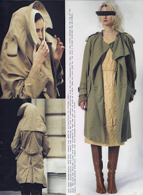
The photograph above shows a classic trench with the collar
enlarged – this present the idea of being protected/hidden. It is made by
incorporating two vintage coats (fabrics have a history). I like how the
garments still have a deffinate structure and the deconstruction process has
not hindered this, they still look new and modern. Also note the tabi boots in
this image that are probably the most iconic accessory of the house. They are
inspired by Japanese tabi.
Flat garments like the ones above and below also caught my
eye as you need zero waste garments to be somewhat flat and geometric to be
made into patterns. This image is from the 1998 collection that is a series of
flat garments whose structure has been adapted so that when they are not worn,
they fall totally flat. Assembling panels of industrial garment patterning
create foldable pieces. The collection also includes garments that have
full-length zippers along the sides, which allow them to be opened completely
and laid flat.
The photograph above shows the displacement of the shoulder
line towards the front and flattened through a special ‘crushing’ process. I
like the aesthetic that this creates.
In conclusion, Maison Martin Margiela is a house, which I
completely admire and am inspired to. I believe, concepts of time and the view
on the human body could really cohesively work into my project.


No comments:
Post a Comment